


前言
在前端开发领域,视觉化的概念和流程对于理解和沟通至关重要。无论是流程图、架构图还是信息图,这些视觉化工具在技术文档、PPT材料和项目沟通中都发挥着重要作用。本文将探讨如何有效地使用 Prompt ,借助 GPT-4o 生成前端技术图示。
一、图示类型
图示可以大致分为以下几种主要类型,每种类型都有其特定的应用场景和 Prompt 要点:
1. 流程图
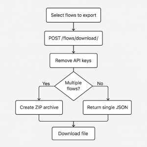
处理流程:如展示导出过程会在生成导出文件之前自动删除 API 密钥等敏感信息。
可使用矩形表示过程步骤,菱形表示决策点,以自上而下的层次布局呈现流程。
Create a minimalist flowchart diagram with the following clean and professional design: The flowchart should have a top-down hierarchical layout. Use rectangles for process steps and diamonds for decision points.
Start:
Step 1: Select flows to export (rectangle at the top).
Step 2: POST /flows/download/ (rectangle below the first).
Step 3: Remove API keys (rectangle below the second).
Decision: Multiple flows? (diamond below the third rectangle).
Left Path (Yes):
Step 4A: Create ZIP archive (rectangle).
Right Path (No):
Step 4B: Return single JSON (rectangle).
Converge: Both paths lead to Download file (rectangle at the bottom).![图片[1]-GPT-4o 生成前端图示 Prompt 指南-知遇博客](https://www.mezhiyu.com/wp-content/uploads/2025/07/4a47a0db6e161349.png)
工作流:如展示代码准备、构建配置到部署的循环流程及步骤。
采用圆形流程布局,步骤用圆角矩形表示,通过平滑曲线箭头连接,使用鲜艳的渐变色区分各步骤。
Create a colorful and modern workflow diagram with the following characteristics.
Layout: Circular flow with horizontal top flow, returning bottom flow, forming a loop.
Steps:
Code Preparation, Build Configuration, Module Bundling, Transpiling, Linting, Optimization, Minification, Sourcemaps, Deployment
Style: Rounded rectangles, connected with smooth curved arrows. Vibrant gradients for each step (e.g., orange, purple, teal). Light gray/white background, thin black outlines for shapes. Text: Modern sans-serif font, center-aligned, readable.
Title: "Build Tool Work-Flow" in bold, centered.![图片[2]-GPT-4o 生成前端图示 Prompt 指南-知遇博客](https://www.mezhiyu.com/wp-content/uploads/2025/07/fb5c81ed3a161424.png)
编辑器阶段:如从源代码到词法分析和语法分析的流向。
以水平线性流程呈现,用文档图标表示源代码,矩形表示分析器,箭头标注数据流向和反馈循环。
![图片[3]-GPT-4o 生成前端图示 Prompt 指南-知遇博客](https://www.mezhiyu.com/wp-content/uploads/2025/07/182845aceb161445.jpeg)
Prompt 要点
-
流程图用于清晰呈现处理流程、工作流或阶段等; -
Create a minimalist flowchart diagram指示生成流程图; -
需明确步骤顺序、节点类型及流向关系; -
用菱形 diamond代表条件判断,箭头arrow指示流程方向等。
2. 架构/结构图
层次结构:如展示 AST 的结构与节点关系。
create a minimalist flow diagram for an Abstract Syntax Tree (AST) structure:
Draw arrows to represent relationships:
From Program → VariableDeclaration.
From VariableDeclaration → VariableDeclarator.
From VariableDeclarator → array (red rectangle).
From VariableDeclarator → ArrayExpression.![图片[4]-GPT-4o 生成前端图示 Prompt 指南-知遇博客](https://www.mezhiyu.com/wp-content/uploads/2025/07/09dd8c2662161704.png)
路由系统:如直观展示项目文件结构和基于此的路由系统。
通过文件夹和文件图标表示结构,用文档图标和箭头表示路由关系。
Create a diagram illustrating a file-based routing system for a web application using the following structure and style:
Folder Structure: Draw a box to represent the root folder of the project. Inside the box, create the following hierarchical folder structure:
app/: Add a file named page.tsx.
posts/: Add a file named page.tsx.
Inside posts/, create a subfolder named [id]/ with a file named page.tsx.
Routes: On the right side, draw three document icons to represent routes:
Root route "/".
Route "/posts".
Dynamic route "/posts/[id]".
Use thin, straight arrows to connect files to their corresponding routes:
app/page.tsx → "/".
posts/page.tsx → "/posts".
posts/[id]/page.tsx → "/posts/[id]".![图片[5]-GPT-4o 生成前端图示 Prompt 指南-知遇博客](https://www.mezhiyu.com/wp-content/uploads/2025/07/ddf9c9a455161738.jpeg)
平台架构:如视频流前端架构,直观展示各组件及其关系。
Create a hand-drawn style diagram for the "Architecture of a Video Streaming Platform's Frontend" with the following structure:
Arrange the components as labeled rectangular boxes:
CDN, UI, Client State, Query Cache, Server and Database.
Use curved arrows to represent relationships:
CDN ↔ UI.
UI ↔ Client State.
UI ↔ Query Cache.
Query Cache → Client State.
Query Cache ↔ Server.
Server ↔ Database.![图片[6]-GPT-4o 生成前端图示 Prompt 指南-知遇博客](https://www.mezhiyu.com/wp-content/uploads/2025/07/c57de7ffb6161806.jpeg)
分层架构:如展示云计算架构的前端和后端。
以分层方式呈现各组成部分,添加垂直分隔条表示管理与安全区域。
Create a layered architecture diagram for a cloud computing security architecture with the following structure:
Top Layer (Client Infrastructure):Place a rectangular box at the top labeled "Client Infrastructure". Add an arrow pointing right labeled "Front End".
Middle Layer (Internet): Below the top layer, add a cloud-shaped icon labeled "Internet". Draw bidirectional arrows connecting Client Infrastructure to Internet.
Application Layer: Below the Internet layer, add a rectangular box labeled "Application". Draw bidirectional arrows connecting Internet to Application Layer. Divide this layer into two smaller side-by-side rectangles:
Left: Labeled "Service".
Right: Labeled "Cloud Runtime".
Infrastructure Layer: Below the Service layer, add another rectangular box divided into two sections:
Top Section: Labeled "Storage".
Bottom Section: Labeled "Infrastructure".
Add two vertical bars on either side of the diagram.Ensure the bars span the height of the Application and Infrastructure layers:
Left Bar: Labeled "Management".
Right Bar: Labeled "Security".![图片[7]-GPT-4o 生成前端图示 Prompt 指南-知遇博客](https://www.mezhiyu.com/wp-content/uploads/2025/07/aba4c12c03161831.jpeg)
Vue架构:如一个读取使用 python 后端生成的 JSON 数据,并在模板中显示的页面。
展示 main.js、App.vue 和 readJSON.vue 之间的关系及数据流向。
Create a VUE Architecture diagram with the following design specifications. Three main components: main.js, App.vue, readJSON.vue.
main.js: Small rectangle on the left. Label: "main.js", inside: "render APP" (blue). Numbered circle 1 near top-left. Arrow pointing to App.vue.
App.vue: Larger rectangle in the center. Label: "App.vue", inside: "components: readJSON" (black). "template: show logo" (light gray). Numbered circle 2 near top-left. Arrow pointing to readJSON.vue.
readJSON.vue: Large rectangle on the right. Label: "readJSON.vue", inside: "data: getJSON (needs JQUERY)" (blue). "template: show JSON" (light gray). Numbered circle 3 near top-left.
Additional Elements: Folder icon above readJSON.vue labeled "components". Dotted yellow line connecting folder icon to readJSON.vue.![图片[8]-GPT-4o 生成前端图示 Prompt 指南-知遇博客](https://www.mezhiyu.com/wp-content/uploads/2025/07/4f84f02beb161908.jpeg)
Prompt 要点
-
架构图涵盖系统架构、层次结构等多种类型; -
Create an architecture diagram for a [system]指示生成流程图; -
通过详细描述组件、关系、风格等要素,确保生成的图示精准呈现架构逻辑; -
layer采用分层布局展示架构层级,draw [icons] to represent添加图标标注。
3. 信息图
CSS 指南:如解释如何使用CSS网格居中元素。
提供逐步说明和代码示例,展示不同方法在网格容器中水平和垂直居中的效果。
Develop a guide that explains how to center an element using CSS Grid. Include step-by-step instructions and code examples that demonstrate different methods of centering both horizontally and vertically within a grid container. Highlight the use of properties such as display: grid, justify-items, align-items, justify-content, and align-content. Provide examples for centering a single element as well as multiple elements within a grid layout. Discuss scenarios where using CSS Grid is particularly advantageous for layout design. Ensure the guide is clear and accessible for developers of all skill levels, with visual aids such as code snippets and diagrams to illustrate the concepts.![图片[9]-GPT-4o 生成前端图示 Prompt 指南-知遇博客](https://www.mezhiyu.com/wp-content/uploads/2025/07/7afbb16026162023.png)
概述图释:理解 NPM 和常用命令。
介绍 Node Package Manager 的功能,解释常用命令的作用。
Create an educational infographic about "Understanding NPM (Node Package Manager)" with a clean, modern, and visually appealing design. The infographic should include:
Node Package Manager: Mention it is used to manage project dependencies, install packages, and comes with Node.js.
Highlight the command npm install lodash with an explanation of -g or --global for global installation.
Common Commands:
npm init: Creates a package.json file.
npm install: Installs all dependencies from package.json.
npm start: Runs the start script.
npm update: Updates installed packages.
Add a small NPM logo in the corner for branding.![图片[10]-GPT-4o 生成前端图示 Prompt 指南-知遇博客](https://www.mezhiyu.com/wp-content/uploads/2025/07/586e508f16162056.png)
可视化元素:如通过简洁的网页布局描述和解释 HTML 语义化标签。
展示常见语义化标签在页面布局中的位置,并添加注释说明其用途。
Design an educational infographic about "Semantic HTML". The infographic should include:
Main Layout:
A visual representation of common semantic HTML elements in a webpage layout, similar to the provided image.
Include labeled sections for:
<header><nav><article><section><aside><footer>.
Annotations:
Add brief descriptions or tooltips near each element explaining its purpose. For example:
Use arrows or dotted lines to connect descriptions to the elements.
Footer Section:
Add a note at the bottom of the infographic: "Semantic HTML improves accessibility, SEO, and code readability."![图片[11]-GPT-4o 生成前端图示 Prompt 指南-知遇博客](https://www.mezhiyu.com/wp-content/uploads/2025/07/59b2900aa0162135.png)
交互示意:展示客户端请求照片与服务器响应数据的卡通化设计。
用简单卡通风格的笔记本电脑和服务器表示客户端与服务器,通过曲线箭头表示数据流向。
Create a conceptual illustration showing the interaction between a client (laptop) and a server during a photo request process. The style should be clean, minimalistic, and cartoon-like.
Laptop (Client): Draw a simple cartoon-style laptop with a screen displaying a web page. The screen should show an image of a dog (or any other animal) and some placeholder text. Add a thought bubble above the laptop with the text "Send me photos".
Server: Represent the server as a stack of three black server units inside a cloud shape. Label it as "Server" below or inside the cloud.
Use curved arrows to represent the data flow: One arrow from the laptop to the server (request). Another arrow from the server to the laptop (response).![图片[12]-GPT-4o 生成前端图示 Prompt 指南-知遇博客](https://www.mezhiyu.com/wp-content/uploads/2025/07/d077e4317c162224.jpeg)
Prompt 要点
-
信息图适用于规范指南、图解、知识科普等场景; -
Create an educational infographic指示生成信息图; -
需明确展示内容、标注信息及视觉风格; -
Represent [concept] as使用图标增强可读性,为关键信息添加标注tooltips。
4. 知识图谱类
算法演示:如通过数字块和滑动窗口的动态移动,直观展示滑动窗口算法的核心概念。
Create an educational illustration titled "Understanding the Sliding Window Technique" to visually explain the concept using numbered blocks.
Panel 1: Show numbered blocks (1 to 6) in a horizontal row. Highlight blocks 1, 2, and 3 with a dashed blue rectangle. Caption: "Initial Window".
Panel 2: Show the same blocks, but move the dashed blue rectangle to highlight blocks 2, 3, and 4, showing the window sliding right. Caption: "Window Slides Right".
Footer: Add a caption: "Sliding Window: Efficiently Traversing Data".![图片[13]-GPT-4o 生成前端图示 Prompt 指南-知遇博客](https://www.mezhiyu.com/wp-content/uploads/2025/07/c00b575577162318.png)
数据结构:如链表、树、图、队列、栈等。
以直观图形表示各种数据结构,如用矩形块和箭头表示链表节点,用层次结构表示树等。
Create an educational illustration titled "Fundamental Data Structures and Algorithms" to visually represent key computer science concepts.
Title: Place the title at the top in bold, clear font.
Concepts:
Sorting: Vertical bars of varying heights arranged in ascending order. Label: "SORTING".
Linked List: Rectangular blocks connected by arrows to represent nodes. Label: "LINKED LIST".
Tree: A hierarchical tree structure with circles as nodes and lines as branches. Label: "TREE".
Graph: A network of circles (nodes) connected by arrows (paths). Label: "GRAPH".
Queue: Blocks in a line with arrows showing processing direction. Label: "QUEUE".
Stack: A stack of blocks with an arrow indicating the top (LIFO). Label: "STACK".![图片[14]-GPT-4o 生成前端图示 Prompt 指南-知遇博客](https://www.mezhiyu.com/wp-content/uploads/2025/07/7b6fbd4c59162344.png)
JS 方法:通过简短的例子解释常用的对象方法。
如 Object.keys()、Object.values() 等,使用简单对象图表示方法的输入和输出。
Create a simple and visually engaging graphic to explain "JavaScript Object Methods".
Include 3-4 commonly used object methods with short examples:
Object.keys()
Object.values()
Object.entries()
Object.assign()
Visual Elements:
Use a simple object diagram (e.g., { a: 1, b: 2 }) with arrows pointing to the output of each method.![图片[15]-GPT-4o 生成前端图示 Prompt 指南-知遇博客](https://www.mezhiyu.com/wp-content/uploads/2025/07/d642f8c3d2162424.png)
层次关系:采用同心圆结构,展示 TypeScript, ES6, and ES5 三者的层次关系。
Create a minimalistic, flat-style Venn diagram that visually represents the relationship between TypeScript, ES6, and ES5. The design should use concentric circles with clear labels, a modern color palette, and a clean layout.
The TypeScript circle encompasses the other two, representing that TypeScript builds on both ES6 and ES5.
The ES6 circle is inside the TypeScript circle, representing that ES6 is a subset of TypeScript.
The ES5 circle is the smallest, representing that ES5 is the foundation for both ES6 and TypeScript.![图片[16]-GPT-4o 生成前端图示 Prompt 指南-知遇博客](https://www.mezhiyu.com/wp-content/uploads/2025/07/1e41254412162453.png)
设计模式:通过层次化结构展示 Shape(抽象层)与 Color(实现层)之间的关系。
Create a diagram to illustrate the Bridge Design Pattern in software architecture. The diagram should visually represent the relationship between Shape (abstraction) and Color (implementation). Use a hierarchical structure with clear labels, arrows, and icons to explain the pattern. Incorporate a "contains" relationship to connect the abstraction and implementation layers. The style should be clean and modern.
Place two main boxes side by side: Left Box: Label it "Shape" to represent the abstraction layer. Right Box: Label it "Color" to represent the implementation layer. Draw a red arrow from the "Shape" box to the "Color" box. Label the arrow as "contains" (position the label above the arrow).
Under "Shape": Create two branches leading to: A box labeled "Circle". A box labeled "Square".
Under "Color": Create two branches leading to: A box labeled "Red". A box labeled "Blue".
Add icons below each of the leaf nodes: Circle: A gray sphere icon below. Square: A gray cube icon below. Red: A paintbrush with red paint dripping below. Blue: A paintbrush with blue paint dripping below.![图片[17]-GPT-4o 生成前端图示 Prompt 指南-知遇博客](https://www.mezhiyu.com/wp-content/uploads/2025/07/c9baca3cda162532.png)
Prompt 要点
-
知识图谱类图示用于算法可视化、数据结构展示等; -
Create an educational illustration指示生成知识图谱; -
需强调知识重点、关键步骤及视觉突出方式; -
step-by-step visualization展示执行过程,添加例子详解with short examples。
UI/UX 设计类
响应式布局:展示移动端、平板端和桌面端的布局适配。
Create a 3-panel diagram showing an e-commerce product card adapting to:

Mobile (375px): Stacked layout
Tablet (768px): 2-column grid
Desktop (1440px): 4-column grid
Annotate key CSS properties (flex/grid) for each viewport.![图片[18]-GPT-4o 生成前端图示 Prompt 指南-知遇博客](https://www.mezhiyu.com/wp-content/uploads/2025/07/88399fdcf8162734.png)
页面结构:通过手绘风格的线框设计,展示页面的布局结构,适用于产品界面原型设计。
Create a sketch-style wireframe for an Outfit Page with the following structure:
Section 1: A large rectangle at the top labeled "Outfit Highlight". Inside, add three horizontally stacked rectangles labeled "Product Card Horizontal".
Use a light blue background or cross-hatching for this section.
Section 2: Below the Outfit Highlight, add a horizontal carousel labeled "Collection Carousel".
Include multiple square cards labeled "Outfit Card" in a row. Use a light red background or cross-hatching for this section.
Section 3: Below the first carousel, add another horizontal carousel labeled "Collection Carousel".
Include multiple square cards labeled "Outfit Card" in a row. Use the same light red background or cross-hatching as the first carousel.![图片[19]-GPT-4o 生成前端图示 Prompt 指南-知遇博客](https://www.mezhiyu.com/wp-content/uploads/2025/07/ba6beb7ae2162810.png)
组件样式:如 Material design 样式的按钮。
展示按钮的视觉效果,并提供相应的 HTML/CSS 代码片段。
Generate a Material Design-style button with gradient fill (120x48px, 8px border-radius) displaying 'Submit' text. Use linear-gradient(#3A86FF, #6F2DBD) with a subtle box-shadow on hover. Include the corresponding HTML/CSS code snippet.![图片[20]-GPT-4o 生成前端图示 Prompt 指南-知遇博客](https://www.mezhiyu.com/wp-content/uploads/2025/07/079f4fb55b162842.png)
响应式布局:展示网站在移动设备、平板和桌面设备上的布局变化,呈现组件的排列。
Create a flat-style layout comparison diagram showcasing a responsive web design across three devices: Mobile, Tablet, and Desktop. The design should be clean, minimalistic, and clearly illustrate the rearrangement of website components for each device.
MOBILE Layout: Arrange blocks vertically in a single column. HEADER block at the top. CONTENT block below the header. SIGN UP block below content. Three (FEATURE) blocks stacked vertically.
TABLET Layout: Arrange blocks in a two-column layout. HEADER block spanning both columns at the top. CONTENT block below the header, spanning the left column. SIGN UP block below the header, spanning the right column, next to the content. Three blocks: First block placed below the "SIGN UP" section. Remaining two blocks stacked vertically below the first feature, spanning both columns.
DESKTOP Layout: Arrange blocks in a multi-column layout. HEADER block spanning the entire top row. Three FEATURE blocks Placed in a single row, horizontally aligned. SIGN UP block below the feature row, spanning all columns. CONTENT block at the bottom, spanning the entire width.![图片[21]-GPT-4o 生成前端图示 Prompt 指南-知遇博客](https://www.mezhiyu.com/wp-content/uploads/2025/07/ac6a5cba95162924.jpeg)
Prompt 要点
-
UI/UX 设计类图示聚焦响应式布局、交互流程等; -
Create a sketch-style wireframe for an Outfit Page展示页面布局; -
需强调页面结构及视觉突出方式; -
stacked vertically垂直排列,in a multi-column layout多列布局。
5、对比图
系统对比:如传统金融系统与去中心化金融系统。
Create a comparison diagram to illustrate the difference between the Traditional Financial System and the Decentralized Financial System with the following minimalistic and clean design:
Divide the canvas into two equal vertical sections:
Left Side: Label as "Traditional Financial System".
Right Side: Label as "Decentralized Financial System".
Traditional Financial System (Left Side)
Use bank icons (rectangular buildings with columns) to represent financial institutions. One large central bank icon in the center of the left section. 5-6 smaller bank icons evenly distributed around the central icon. Connect the smaller banks to the central bank using bidirectional arrows (arrows pointing both to and from the central bank). Use black outlines for the icons and arrows for a clean, minimalistic look.
Decentralized Financial System (Right Side)
Use computer monitor icons to represent nodes in the decentralized system. 4-6 monitor icons evenly distributed in a network-like structure. Use double-headed arrows to connect the monitors, forming a mesh network where every node is interconnected. Add a blockchain symbol (e.g., small connected blocks) to emphasize decentralization. Use green accents for the monitors and blockchain symbols to create a modern, vibrant look.![图片[22]-GPT-4o 生成前端图示 Prompt 指南-知遇博客](https://www.mezhiyu.com/wp-content/uploads/2025/07/75c168b671163035.png)
样式对比:Box-Shadow vs Drop-Shadow
Create a simple and visually clear graphic titled "Box-Shadow vs Drop-Shadow in CSS". The design should include:
Definition:
Box-Shadow:"Applies a shadow to the box (element's frame, including background and borders)."
Drop-Shadow:"Applies a shadow to the content of the element (e.g., text, images)."
Include a side-by-side comparison:
Box-Shadow:Affects the entire box, including padding and borders.
Example:
box-shadow: 5px 5px 10px rgba(0, 0, 0, 0.5);
Drop-Shadow:Affects only the visible content (e.g., text or an image).
Example:
filter: drop-shadow(5px 5px 10px rgba(0, 0, 0, 0.5));
Visual Example:
Show two side-by-side examples:
Box-Shadow: A shadow applied to a colored box with padding and border.
Drop-Shadow: A shadow applied to an image or text with no box around it.![图片[23]-GPT-4o 生成前端图示 Prompt 指南-知遇博客](https://www.mezhiyu.com/wp-content/uploads/2025/07/7ae5e99a8c163113.png)
差异面板:如展示两大前端框架的对比信息。
Design a comparison infographic showcasing the differences between two web frameworks, Svelte and Vue. The layout should feature two vertical panels, one for each framework, with a VS icon in the center. Each panel should include the framework’s logo, name, description, and key features. Use vibrant colors for differentiation and a clean, modern style. Each panel should include:
The framework logo at the top. The framework name in bold, uppercase text below the logo.
A short description of the framework in smaller text below the name. Add a "Popular For" section in each panel with a bold label.
List 4 key features for each framework below the label.![图片[24]-GPT-4o 生成前端图示 Prompt 指南-知遇博客](https://www.mezhiyu.com/wp-content/uploads/2025/07/2484a7df36163137.png)
Prompt 要点
-
对比图用于系统对比、样式对比等; -
Design a comparison infographic showcasing the differences between展示对比; -
需清晰呈现对比对象、差异点及示例; -
side-by-side comparison并列展示,添加对比图标VS icon。
6、PPT 素材
矩形卡片:如 2×2 网格布局展示四大最佳实践。
设计简洁的矩形卡片,每个卡片包含一个主题和简要说明。
Design a modern infographic titled "Best Practices in Frontend Architecture". The design should include four rounded rectangular cards, each with a gradient background and a number label. The cards should be arranged in a 2x2 grid and include concise text in a clean font. Follow the structure and style below:
Card 1: "Design handoff optimization".
Card 2: "Up-to-date CSS Framework".
Card 3: "Standard Design Practices".
Card 4: "Collaborate on UI/UX design".![图片[25]-GPT-4o 生成前端图示 Prompt 指南-知遇博客](https://www.mezhiyu.com/wp-content/uploads/2025/07/a969aaab99163233.png)
分点概念:如介绍基本AI概念。
以简洁的图形和文字介绍机器学习、神经网络等基本概念。
Create a simple and visually appealing graphic titled "AI Concepts You Should Know". The design should include:
Key Concepts: Highlight 5-6 fundamental AI concepts with short, beginner-friendly definitions:
Machine Learning (ML)
Neural Networks
Deep Learning
Natural Language Processing (NLP)
Computer Vision
Reinforcement Learning
Visual Elements:
Use simple icons or illustrations to represent each concept (e.g., a brain for neural networks, a chat bubble for NLP, a camera for computer vision).
Arrange the concepts in a clean, easy-to-follow layout (e.g., grid or flowchart).![图片[26]-GPT-4o 生成前端图示 Prompt 指南-知遇博客](https://www.mezhiyu.com/wp-content/uploads/2025/07/258f63b944163315.png)
花状布局:如通过中心圆形标题和四个对称排列的外围圆形元素构成花状布局,直观展示前端架构的四大优势。
Design a modern infographic titled "Benefits of Frontend Architecture" using the following elements:
Central Circle (Title) Contains the title, bold sans-serif font. Highlight "Frontend Architecture" in black. Add small colorful dots below the title for decoration.
Outer Circles Layout: Four circles symmetrically arranged around the central circle in a flower-like pattern.
Design: Bold number (e.g., "01", "02"). Short phrase describing a benefit. White background with unique border colors:
Circle 1: Green, "Separation of Concerns (SoC)".
Circle 2: Orange, "Technology Independence".
Circle 3: Pink, "Rapid Development".
Circle 4: Teal, "Targeted Testing".![图片[27]-GPT-4o 生成前端图示 Prompt 指南-知遇博客](https://www.mezhiyu.com/wp-content/uploads/2025/07/fff5c6cf4c163352.png)
核心元素:如通过水平排列的重叠圆形元素,直观展示前端架构的核心需求。
Create a professional and visually appealing infographic titled "Requirement for a Front End Architecture". The design should use a light gradient background and feature four interconnected circular elements to represent key requirements. Each circle should include an icon and a label. Use a clean, modern style with vibrant colors. Follow the structure and style below:
Create four overlapping circles arranged horizontally. Each circle should have a two-tone color scheme (e.g., yellow, orange, blue, red) and include:
An icon in the center that represents the requirement.
A label above or below the circle.
The circles should overlap slightly to create a sense of connection.
First Circle:
Icon: Four small squares representing a tech stack.
Label: "Choose proper tech stack".
Second Circle:
Icon: A browser window with a gear, representing development processes.
Label: "Modify development processes".
Third Circle:
Icon: A cube with arrows, representing scalability.
Label: "Improve project scalability".
Fourth Circle:
Icon: A browser window with code, representing web app development.
Label: "Establish robust web app development".![图片[28]-GPT-4o 生成前端图示 Prompt 指南-知遇博客](https://www.mezhiyu.com/wp-content/uploads/2025/07/b915326044163430.png)
环形饼图:如通过中心圆形标题和周围五个均等分割的彩色扇形区域,直观展示前端架构的五大优势。
Create a colorful circular infographic titled "Benefits of Frontend Architecture" with the following structure and style:
Large central circle with the title "Benefits of Frontend Architecture" in bold, modern sans-serif font. Clean white background inside the circle.
Surrounding Segments: Divide the area around the central circle into five equal segments, representing the benefits:
"Rapid Development"
"Modularity"
"Code Reusability"
"Maintainability"
"Technology Independence"
Use soft pastel colors for each segment with either a smooth gradient or solid fill. Add a slight white border between segments for separation.![图片[29]-GPT-4o 生成前端图示 Prompt 指南-知遇博客](https://www.mezhiyu.com/wp-content/uploads/2025/07/5004a2bbca163459.png)
带序列表:如通过水平流程布局直观展示五大前端开发优势。
每个优势用带编号的图标和简要文字表示。
Create an infographic showcasing the benefits of Front-End Development with the following modern and professional design:
Subtitle: Below the title, add "Benefits of Front-End Development" in a smaller, lighter font.
Use a horizontal flowchart with five sections (boxes) aligned in a row. Each box represents one benefit and is numbered from 01 to 05. Use rounded rectangles for each box with a subtle shadow effect.
Add a number circle (e.g., "01") at the top-left corner of each box. Add an icon that represents the benefit. Below the icon, include a short description in white, bold text.
Content for Each Box
Box 1:
Icon: Shield
Text: "Secure, Scalable & Speedy Development Process"
Box 2:
Icon: Responsive screen
Text: "Reactive & Responsive Feature & Apps"
Box 3:
Icon: Live interaction symbol
Text: "Realtime & Interactive Programming Interface"
Box 4:
Icon: Globe
Text: "Cross Platform & Cross Browser Compatibility"
Box 5:
Icon: Code snippet
Text: "Reliable & Robust Coding Environment"![图片[30]-GPT-4o 生成前端图示 Prompt 指南-知遇博客](https://www.mezhiyu.com/wp-content/uploads/2025/07/19ee203f02163528.png)
Prompt 要点
-
PPT 素材图示注重简洁美观与信息传达; -
Create a simple and visually appealinginfographic showcasing直观展示信息; -
需明确布局、内容及风格要求; -
2x2 grid指定布局,添加编号number label和简易图解icons or illustrations。
7、meme/梗图
卡通场景:如用 CSS z-index: 9999 修复布局问题的搞笑情节。
Create a humorous, meme-style illustration titled "Fix Everything with CSS z-index: 9999". The design should visually emphasize the power of using z-index: 9999 to solve layout issues in web development.
Panel 1:
Setting: A leaking tank with water gushing out from a large crack.
Characters: A person approaching the tank with a confident expression, holding a piece of "CSS tape" (a black rectangle labeled "z-index: 9999").
Text Overlay: Above the leaking crack, add the text "Slightly Obscured Element" to represent the problem.
Panel 2:
Focus: Zoom in on the person slapping the "CSS tape" (labeled "z-index: 9999") onto the leaking crack.
Effect: Show the water flow stopping instantly, with sparkles or exaggerated visual effects around the fixed area to emphasize the "miracle fix."
Text Overlay: Add a bold caption near the patch that reads "z-index: 9999".![图片[31]-GPT-4o 生成前端图示 Prompt 指南-知遇博客](https://www.mezhiyu.com/wp-content/uploads/2025/07/7d2045f2f6163637.png)
拟人化插画:如将全栈开发者的多技能比喻为独角兽的神奇能力。
通过拟人化的插画形象地表示全栈开发者的技能。
Create a whimsical, comic-style illustration titled "The Mythical Full Stack Unicorn".
Panel 1:
A whimsical forest or tech-themed landscape. Three separate animals, each expressing a limitation:
A bear (labeled "I can't fly.").
A fish in a bowl (labeled "I can't walk.").
A bird (labeled "I can't swim.").
Panel 2:
Transform these animals into a single, majestic unicorn. Wings representing the ability to "fly" (frontend skills).Hooves for "walking" (backend skills).Fins or a water-themed mane for "swimming" (database skills).Add a horn to symbolize the mythical and versatile nature.
Text Overlay: Above the unicorn, place the text "Full Stack Developer".![图片[32]-GPT-4o 生成前端图示 Prompt 指南-知遇博客](https://www.mezhiyu.com/wp-content/uploads/2025/07/161306a460163709.png)
对比场景:如通过铁路轨道形象化展示传统开发与 AI 开发的效率与复杂性差异。
Create a humorous illustration titled "The Impact of AI on App Development" using railway tracks as a metaphor to contrast traditional and AI-assisted app development.
Left Panel: A straight, simple railway track with the caption "Apps Built Without AI in 5 Hours." Minimalist environment with clear skies.
Right Panel: A complex, branching network of tracks with the caption "Apps Built With AI Agents in 5 Minutes." Dynamic, busy environment with signals and signs.![图片[33]-GPT-4o 生成前端图示 Prompt 指南-知遇博客](https://www.mezhiyu.com/wp-content/uploads/2025/07/9c86482e30163740.png)
卡通概念:展示机器将 HTML、CSS 和 JavaScript 文件转化为最终产品(按钮)。
Create a conceptual illustration of a machine processing web development components into a final product. The style should be clean, minimalistic, and cartoon-like.
Illustrate three colorful file icons being fed into the machine:
HTML file: Orange icon with the text </> HTML.
CSS file: Blue icon with the text { } CSS.
JavaScript file: Purple icon with the text Js.
From the machine spout, show a blue button-shaped object labeled "BUTTON" emerging as the final product.![图片[34]-GPT-4o 生成前端图示 Prompt 指南-知遇博客](https://www.mezhiyu.com/wp-content/uploads/2025/07/0a15afc492163812.png)
Prompt 要点
-
meme / 梗图以幽默方式呈现前端知识; -
Create a humorous, meme-style illustration创作梗图; -
需构思有趣场景与视觉元素; -
可先借助 AI 脑爆和构思创意脚本。
二、Prompt 技巧
1. 明确定义图表类型
显式声明图表类型(flowchart, architecture diagram, comparison infographic 等),并清晰地描述图示的类型和用途:
Create a flowchart of event propagation phases: capturing → target → bubbling2. 细化内容
避免模糊描述:
❌ “Show how React works”
✅ “Diagram React component lifecycle with mounting/updating/unmounting phases”
提供足够的细节,确保生成的内容符合预期。例如:
-
关系连接: "dashed arrows indicate async operations" -
状态标识: red→green for state transitions -
组件标注: Include: API Gateway (center), Auth Service (left), DB Cluster (right)
3. 风格约束
定义视觉风格和设计规范:
-
指定视觉风格: flat design,isometric view,hand-drawn style等 -
字体要求: Fira Code font,monospace等 -
色彩规范: soft pastel colors、smooth gradient、solid fill等
4. 套用模板
• 技术对比图:
Create comparison infographic: [Technology A] vs [Technology B]
Include sections: Key features, Use cases, Performance metrics
Use split layout with [Color A] and [Color B] themes
• 组件架构图:
Diagram [Component] structure with:
- Core module (center)
- Dependent submodules (surrounding)
- API interfaces (connecting lines)
Use layered coloring with 3 distinct hues
• 工作流程图:
Flowchart of [Process] with:
Start/End nodes (circles)
Decision points (diamonds)
Actions (rectangles)
Annotate arrows with condition checks
• 响应式布局:
Show responsive breakpoints:
Mobile ([px]):
- [layout]
Tablet ([px]):
- [layout]
Desktop ([px]):
- [layout]
Annotate media query values
• 算法可视化:
Visualize the [Algorithm Name] step-by-step:
- Show key operations (e.g., sorting, searching)
- Highlight changes in state (e.g., red to green for completed steps)
- Include annotations explaining each step
Use a dynamic, animated format if possible
• 交互流程:
Create an interaction flow diagram for [Feature Name]:
- Start with user action (e.g., click, submit)
- Show system response (e.g., validation, feedback)
- Include decision points and possible outcomes
Use rounded rectangles and arrows to indicate flow
• 信息图示:
Design an infographic about [Topic Name]:
- Include key concepts with brief descriptions
- Use icons or illustrations to represent each concept
- Arrange in a clean, easy-to-follow layout (e.g., grid or flowchart)
Add a title and subtitle for context
• Meme:
Create a humorous meme-style illustration titled "[Title]":
- Panel 1: [Description of first scene]
- Panel 2: [Description of second scene]
- Add text overlays for punchlines or explanations
Use a cartoonish or whimsical style
总结与期望
结合 Prompt 技巧,通过 GPT-4o 能够高效生成前端相关的图示,帮助直观地传达复杂的技术信息。在实际使用中,我们可以结合具体需求灵活细化 Prompt,使生成的图片更符合预期。希望未来,随着 AI 技术持续进步,我们只需简单描述需求,便可快速生成高质量的技术图示,提升文档编写和技术分享的效率。


![表情[yiwen]-知遇博客](https://www.mezhiyu.com/wp-content/themes/zibll/img/smilies/yiwen.gif)

暂无评论内容